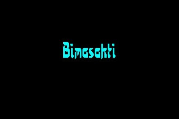
Bimasakti: A Bold Display Font for Impactful Web Design
As a UI designer who builds landing pages, SaaS dashboards, and e-commerce experiences, I treat typography like architecture—it shapes how users move through a screen, where they pause, and what they remember. That’s why Bimasakti stands out: it’s not just another decorative font. It’s a thoughtfully crafted display typeface that balances expressive curves with precise sharp edges—creating visual tension that commands attention without sacrificing clarity.
Designed by Wates Awal, Bimasakti lives in the sweet spot between personality and professionalism. Its medium weight gives it presence at large sizes but avoids heaviness that can overwhelm smaller layouts. Unlike overly ornate script or ultra-thin modern fonts, Bimasakti delivers strong legibility on screens—even at 48px on mobile hero sections. That makes it ideal for digital contexts where first impressions happen in under three seconds.
Where Bimasakti Fits in Your Digital Layouts
I reach for Bimasakti when I need to establish hierarchy fast—especially in high-intent areas. Think: the headline above your primary CTA button, the title of a course sales page, or the brand name in a dark-mode portfolio header. It works best for short, high-impact text: “Launch Your Brand,” “Join the Waitlist,” “New Collection Live.” It’s not built for body copy or long paragraphs—and that’s intentional. As a display font, its strength lies in contrast.
In practice, I’ve used Bimasakti on:
- Landing page hero banners for creative agencies—paired with a clean sans serif like Inter or Manrope for subheadings and buttons
- Product launch announcements on Shopify stores, where it anchors banner graphics overlaid on lifestyle imagery
- Coaching website section headers (“Your Journey Starts Here”) that need warmth and authority in equal measure
- Digital brand kits for freelance designers—where Bimasakti becomes the signature accent in logo lockups and social media templates
Readability & Responsiveness: Real-World Considerations
On mobile, Bimasakti performs well down to ~36px—but only when used as a standalone headline, not inline with other text. I avoid using it inside buttons smaller than 140px wide; the curves and angles need breathing room. For dark backgrounds, I add subtle letter-spacing (0.5–1px) and ensure contrast meets WCAG AA standards—Bimasakti’s medium weight helps here, especially against deep charcoal or navy.
Over image overlays? Yes—but only with a solid color mask or subtle drop shadow behind the text. Its balanced stroke contrast prevents visual “vibration” against busy photography. On light backgrounds, it reads cleanly without extra tweaks—just make sure your line-height stays generous (1.2–1.3) to preserve rhythm.
Smart Pairing for Digital Consistency
Bimasakti thrives when paired with functional, highly legible companions. My go-to is a neutral sans serif—Inter, Poppins, or even system fonts like -apple-system—for all supporting text: navigation, form labels, paragraph copy, and pricing tables. This pairing creates clear typographic roles: Bimasakti = voice and identity; the sans serif = utility and trust.
For editorial or luxury-leaning sites, I’ll sometimes pair it with a restrained serif like Cormorant Garamond (for blog headers or quote accents), but only when the serif has enough x-height and open counters to hold its own next to Bimasakti’s confident geometry. Avoid pairing it with other display fonts—no competing personalities in one viewport.
Freebies with Purpose: What You Get & How to Use Them Right
Bimasakti is offered as a freebie, which makes it accessible for indie creators, bootstrapped founders, and designers building early-stage products. It ships as a standard OTF/TTF package—ready for local use in Figma, Adobe apps, or design handoff. For live websites, you’ll need to self-host the files or convert them to WOFF2 for optimal web performance.
It includes one weight (medium) and basic Latin character support—covering English, Indonesian, Spanish, French, and similar languages. No alternates or stylistic sets are included, so don’t expect swashes or contextual ligatures. That’s fine: its power comes from restraint, not ornamentation.
Crucially—check the license before deploying. While free for personal use, many free fonts restrict commercial use in client work, SaaS interfaces, or online stores unless upgraded. If you’re embedding Bimasakti into a template you sell, a white-labeled dashboard, or a Shopify theme, verify whether Wates Awal permits redistribution or requires a commercial license. When in doubt, reach out directly—the creator’s GitHub or portfolio page usually links to full terms.
When to Choose Bimasakti Over Other Fonts
Compare it to popular alternatives: Montserrat Black feels too rigid for human-centered brands; Playfair Display leans too traditional for tech or wellness startups; a handwritten font lacks the polish needed for premium positioning. Bimasakti bridges that gap—it’s contemporary but not cold, distinctive but not distracting, bold but not aggressive.
It’s especially effective for brands that want to signal creativity *and* credibility—think boutique design studios, mindful coaching platforms, or sustainable product brands. In those cases, Bimasakti doesn’t shout; it states. And in digital spaces saturated with generic fonts, that kind of quiet confidence converts.
Ultimately, Bimasakti isn’t about decoration—it’s about intention. Every curve, every angle, every spacing decision supports a single goal: helping your message land faster, feel more memorable, and align precisely with the tone your audience expects. In web design, where milliseconds and micro-decisions shape perception, that’s not just typography. It’s strategy.