Zephyrine: A Display Font That Earns Its Space in Real Campaigns
It’s 3:47 p.m. on launch day for a new online course series — the kind built around short, energizing lessons and visual storytelling. I’m tweaking the final Instagram carousel post: slide three needs a bold, confident headline overlay on a muted gradient background. The previous font felt flat — too neutral, too safe. So I drop in Zephyrine Regular. Instantly, the headline breathes. Not loud, not gimmicky — just present, intentional, and quietly commanding. That’s when it clicks: Zephyrine isn’t just another display font. It’s a campaign collaborator.
A Typeface Built for Visual Momentum
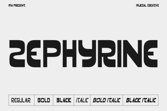
Zephyrine is a modern display font family with six distinct weights — Regular, Regular Italic, Medium, Medium Italic, Black, and Black Italic. Visually, it walks a refined line: clean enough for digital clarity, expressive enough to carry personality. The letterforms have gentle contrast, open counters, and subtle calligraphic warmth in the italics — no sharp edges or aggressive angles. It feels human, but never casual. Think “confident educator,” “thoughtful creator,” or “curated brand” — not “corporate boardroom” or “playground poster.”
In practice, that translates to strong first impressions across fast-moving feeds. On Instagram, Zephyrine Regular holds up beautifully at 48–60pt in story text overlays — legible even with motion blur or quick swipes. On YouTube thumbnails (tested at 1280×720), the Black weight delivers impact without crowding — especially when paired with generous letter spacing and a high-contrast background. For Pinterest pins, its upright rhythm guides the eye cleanly from title to description, supporting scannability without sacrificing elegance.
Where Zephyrine Shines — and Where It Steps Back
Zephyrine excels where display fonts should: short-form, high-impact moments. It’s ideal for:
- Instagram post headlines — especially quote graphics or course module titles (“Week 3: Build Your First System”)
- YouTube thumbnail labels — like “FREE TOOLKIT INSIDE” or “Before & After Demo”
- Digital ad banners — particularly for lifestyle, creative, or learning-focused offers
- Webinar or event banners — giving names and dates presence without shouting
- Email header text — when used at 32–40pt over light or dark backgrounds
- Branded template packs — as the consistent “voice” across Canva or Figma assets
But it’s not a workhorse for everything. Don’t use Zephyrine for body copy, pricing tables, multi-line product descriptions, or anything under 24pt on mobile. Its charm lives in scale and intention — not density. And while it handles light backgrounds gracefully, avoid thin weights (like Regular) on busy image overlays unless you add subtle stroke or shadow for separation.
Pairing It Right — Typography as Strategy
Zephyrine doesn’t need competition — it needs context. In every campaign I’ve used it, pairing it with a neutral sans serif (like Inter, Poppins, or even system fonts like -apple-system) creates immediate hierarchy and balance. For example: Zephyrine Black for “New Course Live”, then Inter SemiBold for “12 actionable lessons • Launching May 15”. That contrast does real work — guiding attention, signaling importance, and keeping tone cohesive.
I’ve also tested it with restrained serif pairings (e.g., Lora or Literata) for more editorial or premium-feeling campaigns — think email newsletters or landing page subheads. Avoid heavy scripts or decorative handwritten fonts unless you’re aiming for deliberate contrast in a limited, one-off graphic. Zephyrine’s quiet confidence can get lost next to overly ornate companions.
Practical Notes Before You Drop It Into Your Next Asset
Zephyrine ships as a complete display font family — all six styles, OpenType features included. That means ligatures, small caps, and stylistic alternates are available if your design tool supports them (Figma, Adobe apps, and modern web platforms do). Check the file formats: most versions include .woff2 and .woff for web use, plus .otf/.ttf for desktop design. Licensing is standard commercial — fine for client projects, digital ads, merch, and SaaS templates, as long as you verify the license permits redistribution if you’re bundling it into editable Canva templates or design kits.
Multilingual support covers Western European languages well — accented characters in French, Spanish, German, and Scandinavian languages render cleanly. If your campaign targets broader regions (e.g., Eastern European or Turkish audiences), double-check glyph coverage before finalizing layouts.
And one real-world tip: always preview Zephyrine on actual devices — not just desktop mockups. On iPhone X and newer, the Regular Italic reads crisply at 36pt in Stories; the Black weight stays sharp even in low-brightness mode. But on older Android screens, I found the Regular weight needed +2pt sizing to maintain clarity in static banners. Small details — but ones that affect whether your message lands or blurs.
Not Just Another Pretty Font
What makes Zephyrine stick in my toolkit isn’t just how it looks — it’s how it behaves across touchpoints. It scales predictably. It adapts to both warm and cool brand palettes. It gives visual weight to ideas without demanding attention for its own sake. In a campaign where consistency matters — say, a 5-part Instagram content series teasing a digital product — using Zephyrine Black for all main headers (with consistent tracking and color) builds instant recognition, even before viewers read the words.
It won’t fix weak messaging. It won’t compensate for poor contrast or cluttered layout. But when paired with smart strategy — clear hierarchy, thoughtful spacing, intentional color — Zephyrine becomes part of the campaign’s voice. Not the loudest voice. Just the right one.